
Some budgeting tools fall at opposite extremes—they’re either too simple or overly complex. The simpler options often allow only one overall budget, without categories to separate different types of expenses, and require users to manually enter transactions, which can be time-consuming for busy schedules. On the other hand, more complex tools include extra features that many budgeting-focused users don’t need, such as dense charts and net-worth tracking, which can distract from the primary goal of managing day-to-day spending.
I learned how important research is for understanding what users truly need from a budgeting tool. It’s also essential to research the tools already on the market and review user feedback to identify each product’s strengths and weaknesses, helping determine whether there is a clear need for a new budgeting solution.
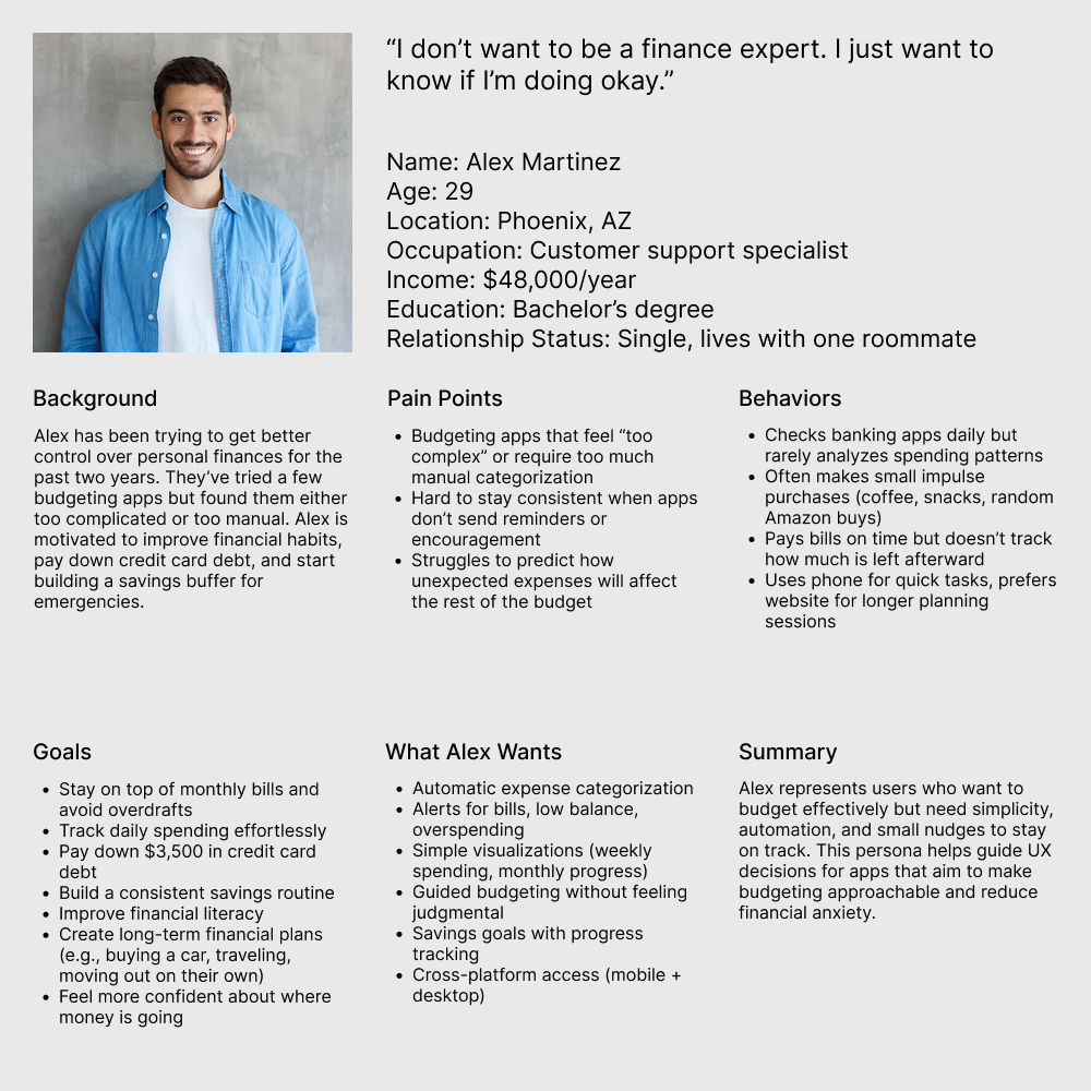
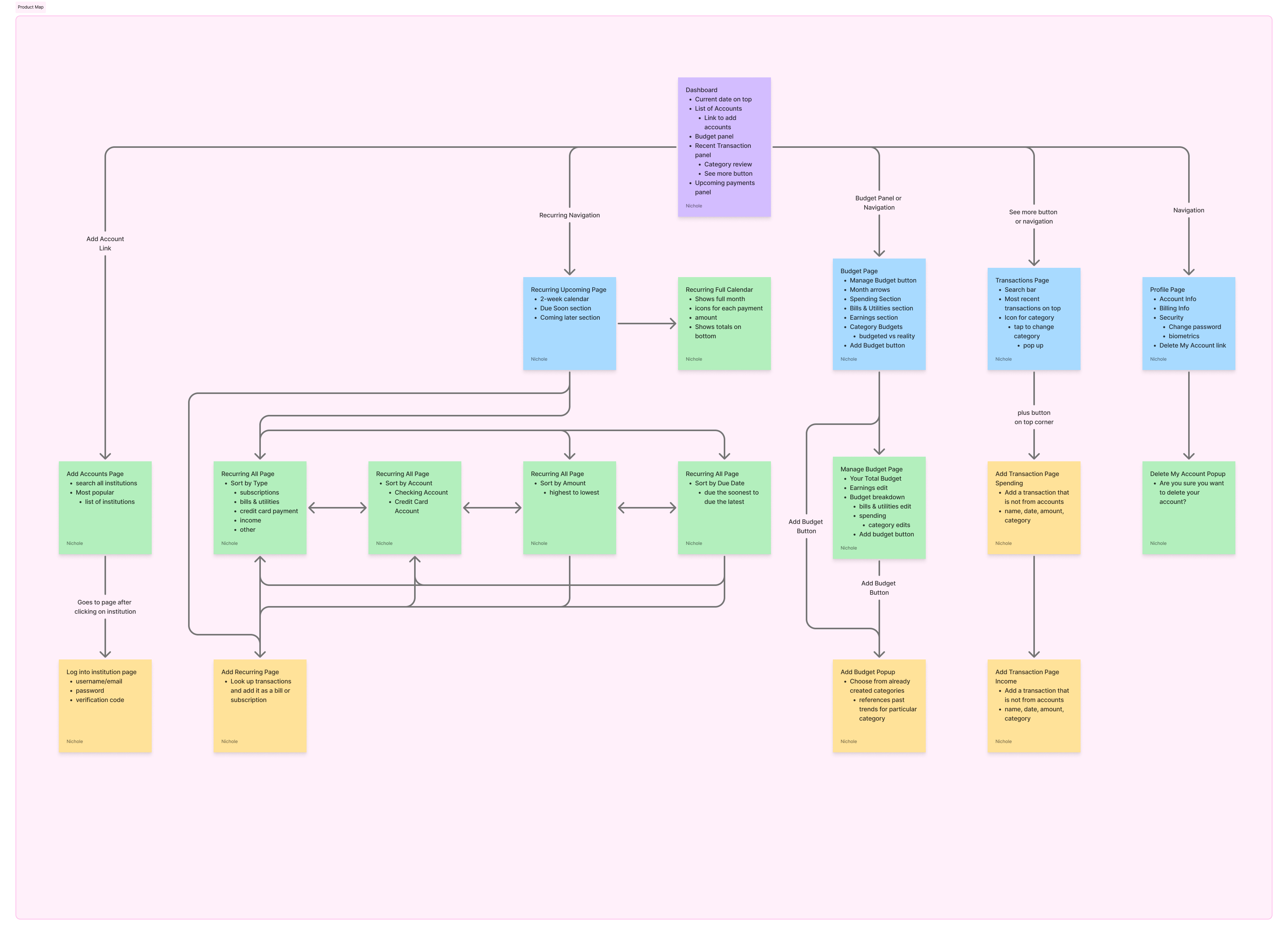
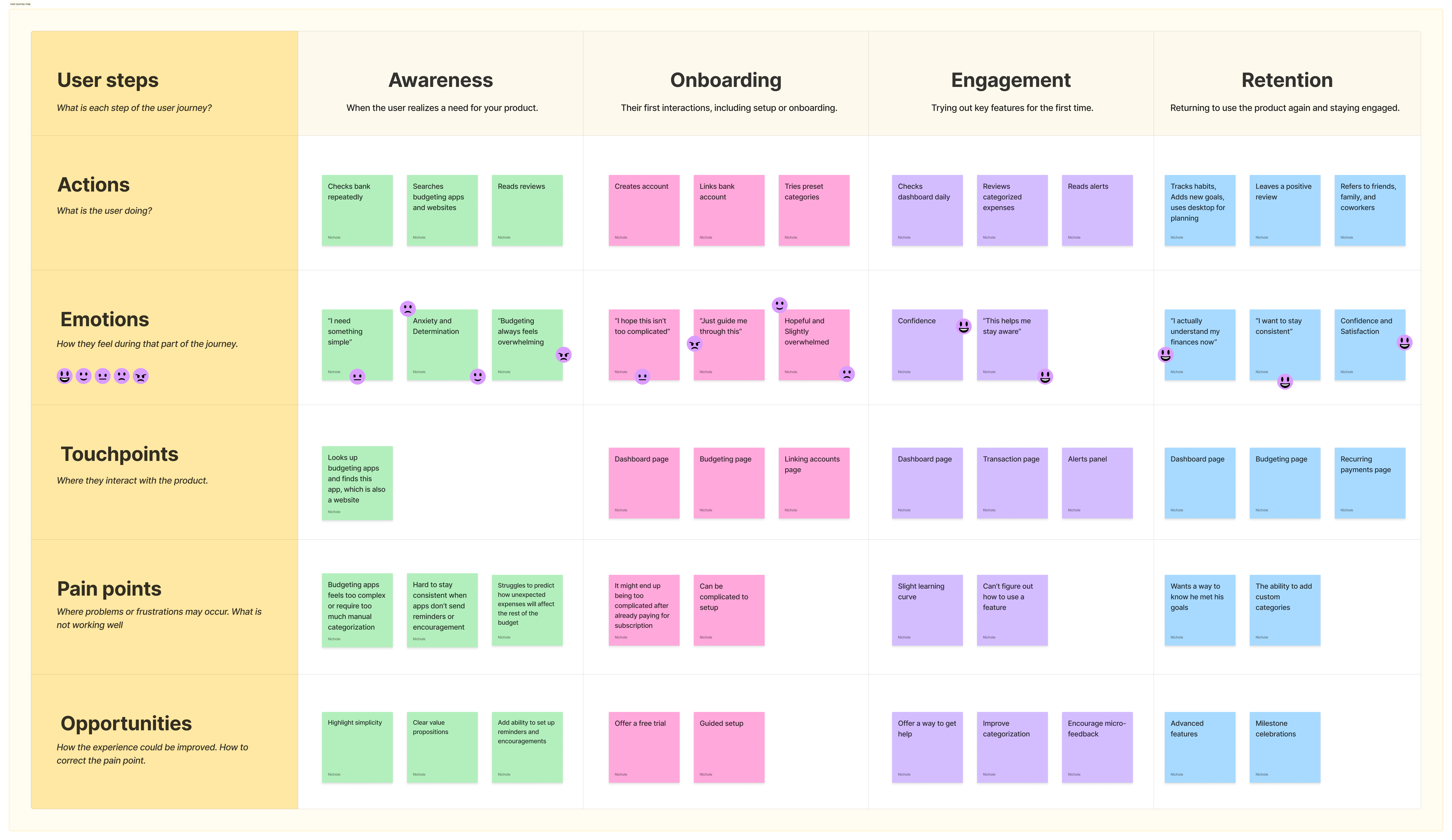
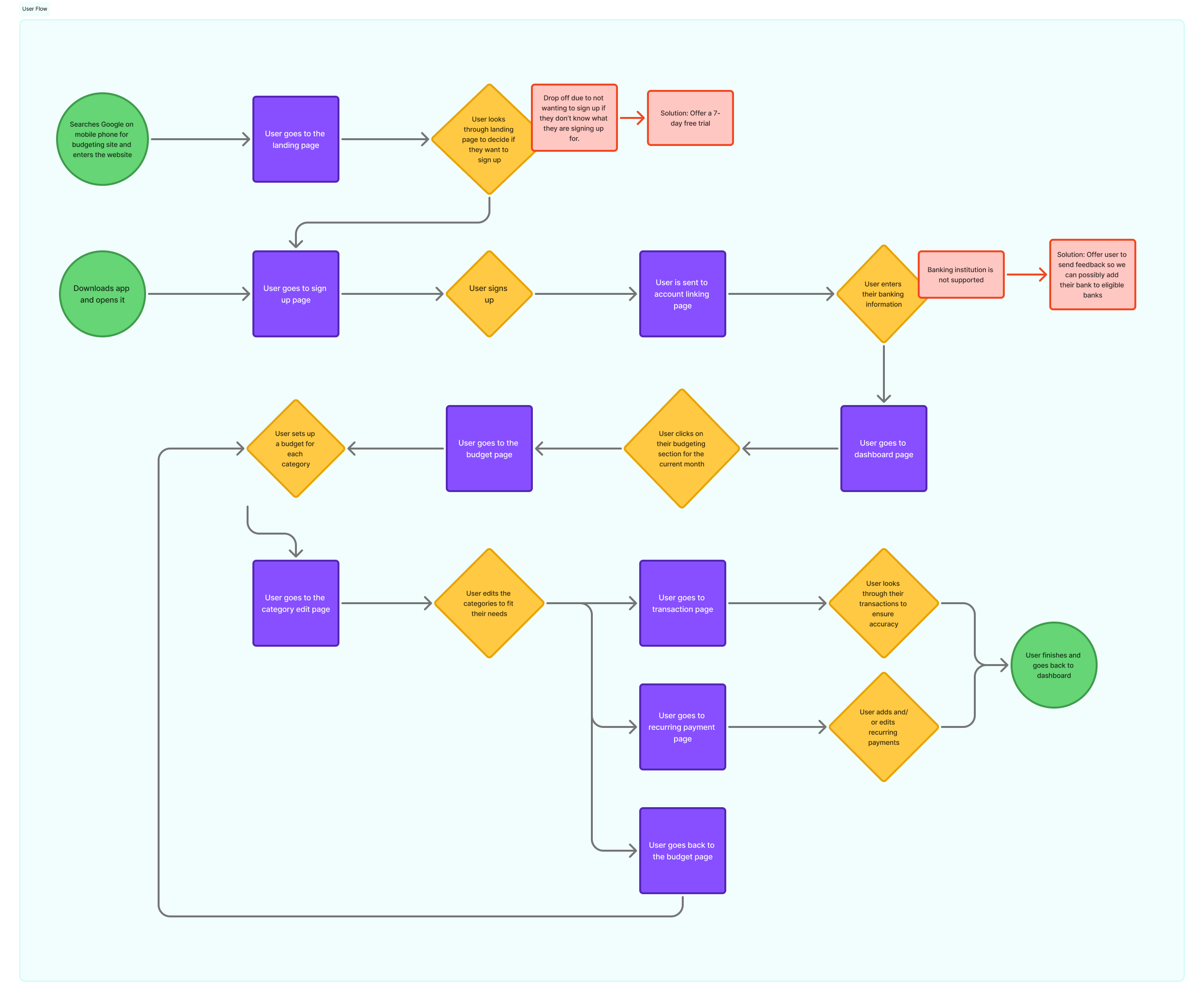
To gain deeper insight, I created a user persona, journey map, and user flow. These helped me better understand the target audience, clarify the product’s value, and map how users would interact with it while identifying potential drop-off points where they might leave the experience.
I began developing a low-fidelity prototype to demonstrate the proposed layout and typography of the product.
After creating several pages for user testing, I received some feedback. One key point was that the typography is too small in certain areas, particularly on the app and mobile versions. I increased the font size to improve readability.
As I worked on the high-fidelity prototype, I added additional pages to better showcase the product's features and functionality.
I also updated the budget page to include a section for savings goals, reflecting a key purpose of the product.
My decisions were guided by the research I conducted, combined with personal reflections from my experience using various budgeting products in the past.
I considered what I would personally want from this type of product and incorporated the features I felt would be most valuable and beneficial for users.
To ensure the layout was accurate, I frequently previewed it on my desktop and on my personal phone using Figma Mirror.
Click on each image to zoom in
When researching products for a budgeting app, I chose Rocket Money, Empower, and Cashew.
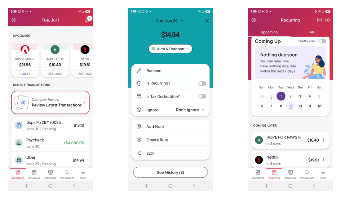
Rocket Money is the strongest of the three options, but it still has a few drawbacks. The biggest issue is how difficult it is to access the budget page. The primary path requires going to the dashboard, scrolling to the “Your Budget” section, and selecting the “[Current Month] Budget.” Budget navigation is also tucked inside the “More” tab at the bottom, which can make it hard for users to locate. On the positive side, the app allows users to customize their dashboard by choosing which sections to display and arranging them in their preferred order.
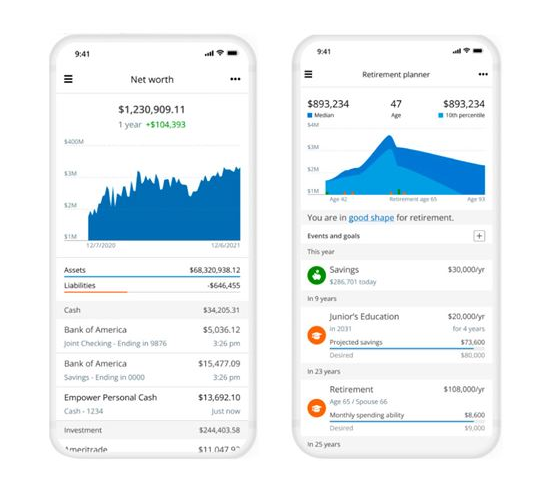
Empower is a free financial tool that includes some budgeting features. From my perspective, the interface can feel confusing and overloaded with charts, and the budgeting tools are somewhat buried within the product. It doesn’t offer customizable spending categories, which limits flexibility. The platform seems geared toward users with larger financial portfolios who want to track their money, rather than those who need hands-on help managing a tighter budget. Many users, myself included, also report frequent issues with account connections that often disconnect.
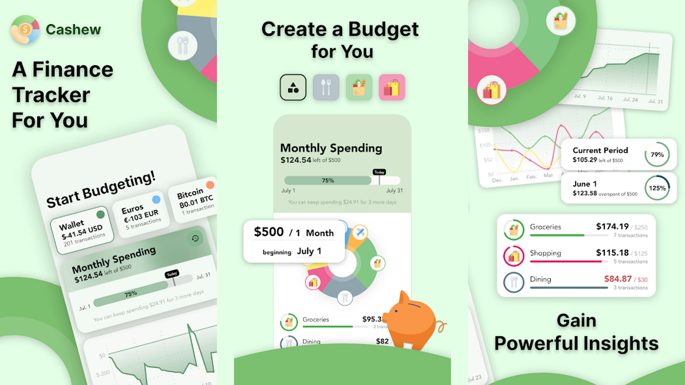
Cashew is a manual budgeting app that lets users enter transactions and monitor their spending. The free version limits users to a single overall budget, which can make it harder to categorize and track different types of expenses. The app has a clean, visually appealing design and offers customizable color themes. Because it doesn’t support bank account connectivity, users must input transactions manually, which can become time-consuming if several days are missed. However, some users appreciate the hands-on approach of manual entry.
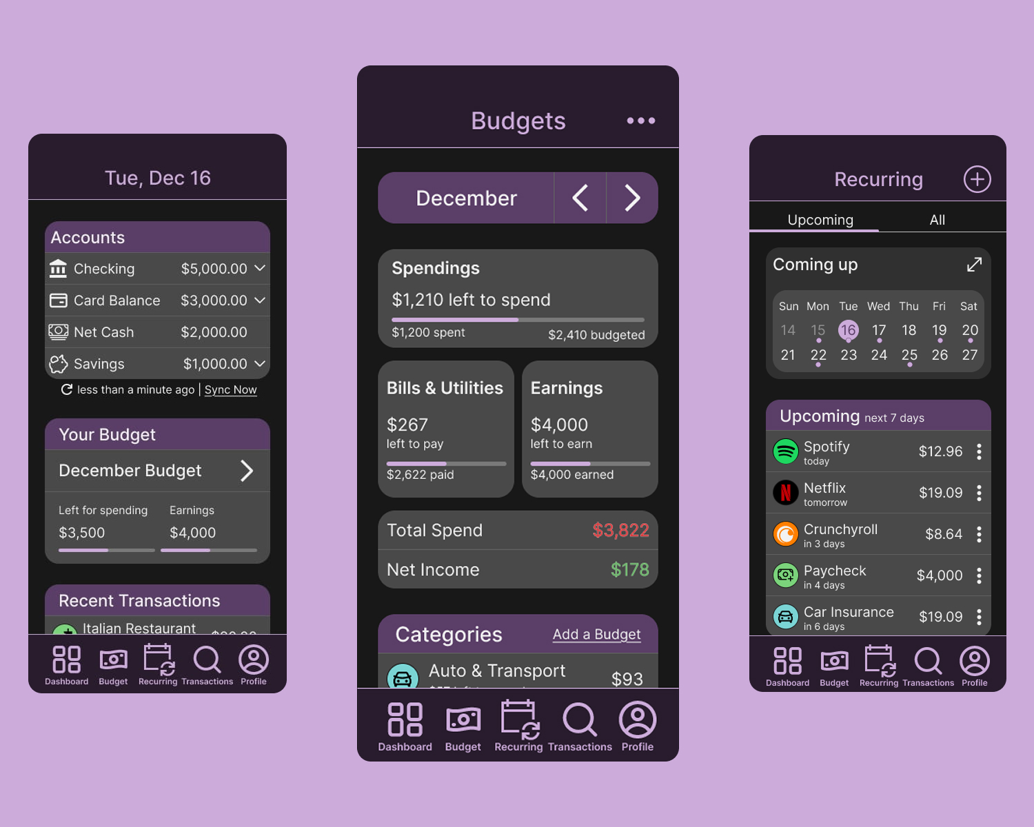
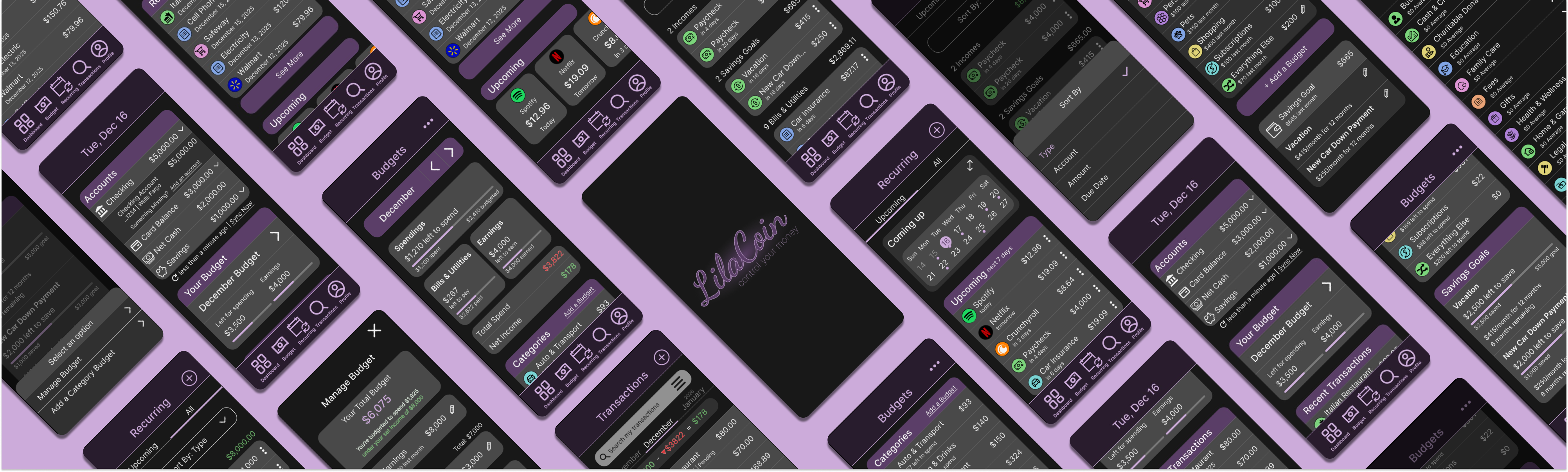
While brainstorming this project, I knew an app version was essential. To keep the experience user-friendly, I placed the main navigation at the bottom and kept it fixed while users scroll for quick, easy access. The top header is also fixed so users always know which page they’re on. The primary pages include Dashboard, Budget, Recurring, Transactions, and Profile, allowing users to reach what they need without tapping through multiple screens.
Go to App PrototypeThe goal of this project is to create a budgeting tool that helps users track their finances and maintain a realistic budget.
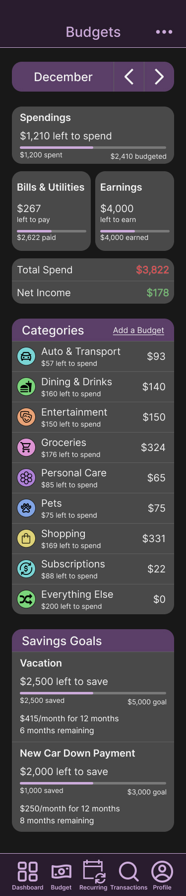
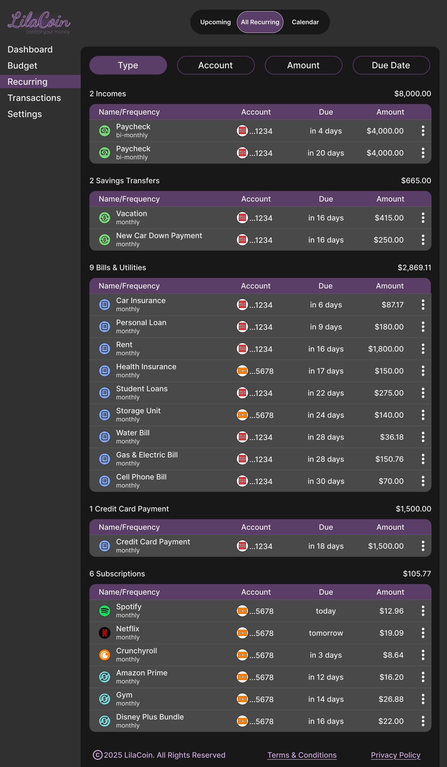
The Budget page is a key focus, beginning with the current month and arrows to navigate between months. A financial overview follows, showing spending, bills & utilities, and earnings, with progress bars to visualize what has been used and what remains. It also displays total spending and current net income.
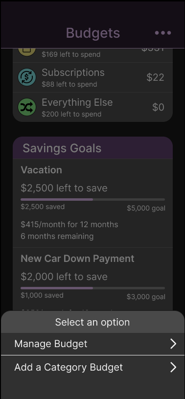
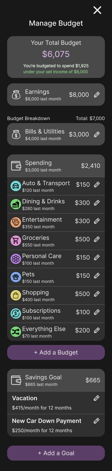
Below this, spending is broken down into clearly labeled categories with amounts spent and remaining budgets, along with options to add or manage categories.
The page concludes with a savings goals section, allowing users to easily see and contribute toward their goals.
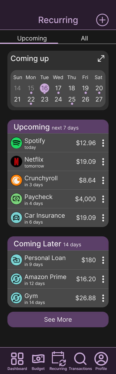
The Recurring page shows transactions that appear on a regular basis, allowing the app to automatically identify them as recurring payments.
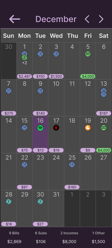
When users tap the Recurring icon in the navigation bar, they land on the Upcoming Recurring page, which includes a compact two-week calendar highlighting upcoming transactions. This can be expanded into a full monthly view with daily totals.
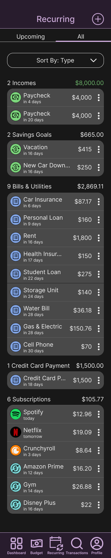
By selecting the All tab, users can see every recurring transaction and sort them by type, account, amount, or due date. In this view, transactions are grouped by type, displaying the number of items and the monthly total for each category.
The mobile version closely mirrors the app version with a few adjustments. Navigation is moved into a top hamburger menu that shows the logo and main pages, and a footer is added to the bottom of the main pages for the full menu and additional links.
Go to Mobile Prototype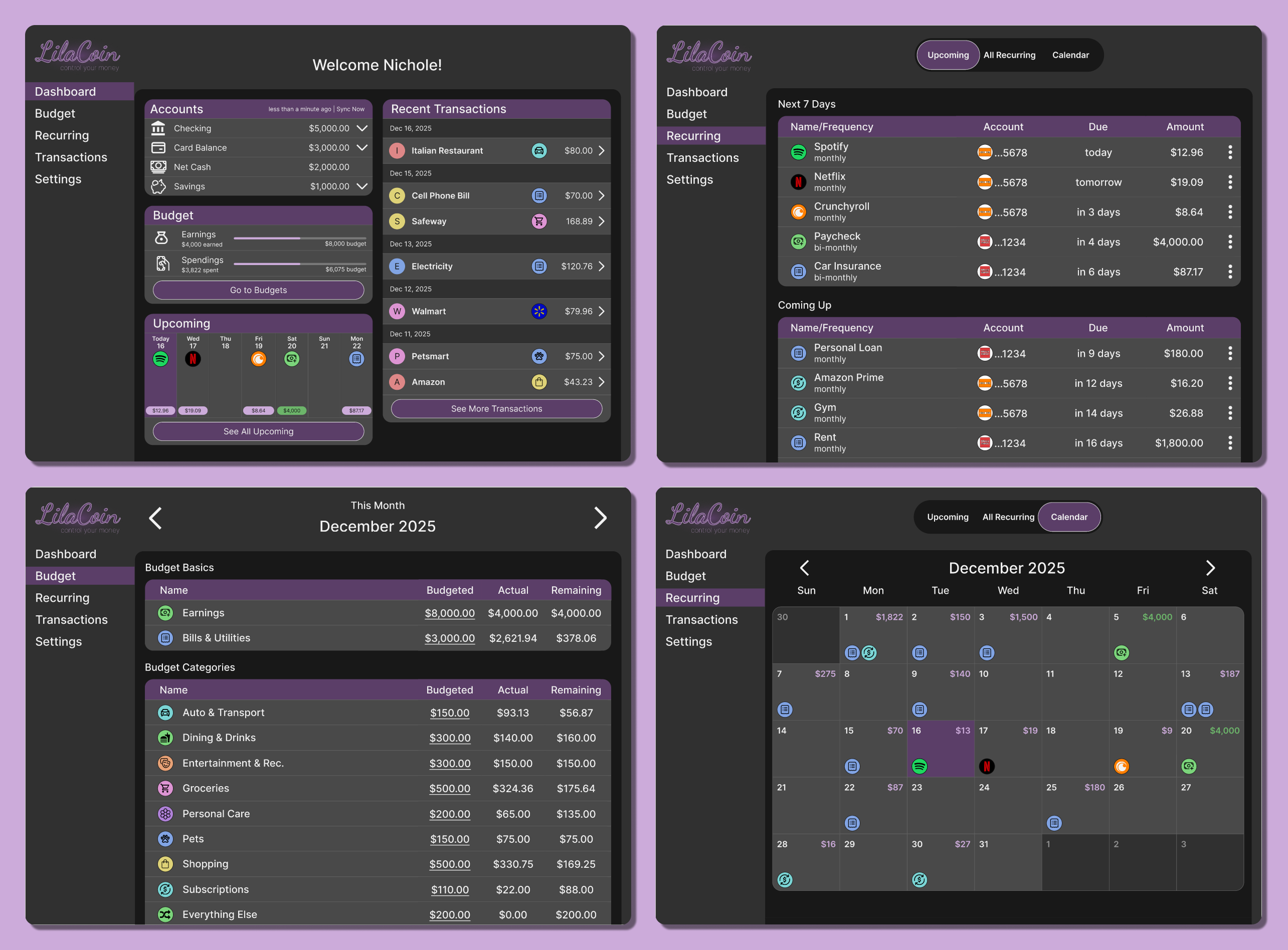
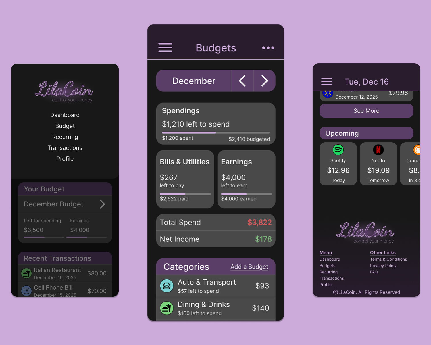
The desktop version provides more information on a single page compared to the app and mobile versions. It’s ideal for users who prefer a larger screen or don’t use a smartphone, allowing them to easily manage their finances.
Go to Desktop PrototypeThe desktop version of the Budget page includes extra details not found in the app or mobile versions. It displays the user’s overall spending budget, the amount spent, and the remaining balance. It also shows how much is available for savings, providing clearer insight into contributions toward savings goals.
Another important feature is the ability to edit each budget category directly on the page. Users can simply click the budget amount and adjust the numbers to match their preferences
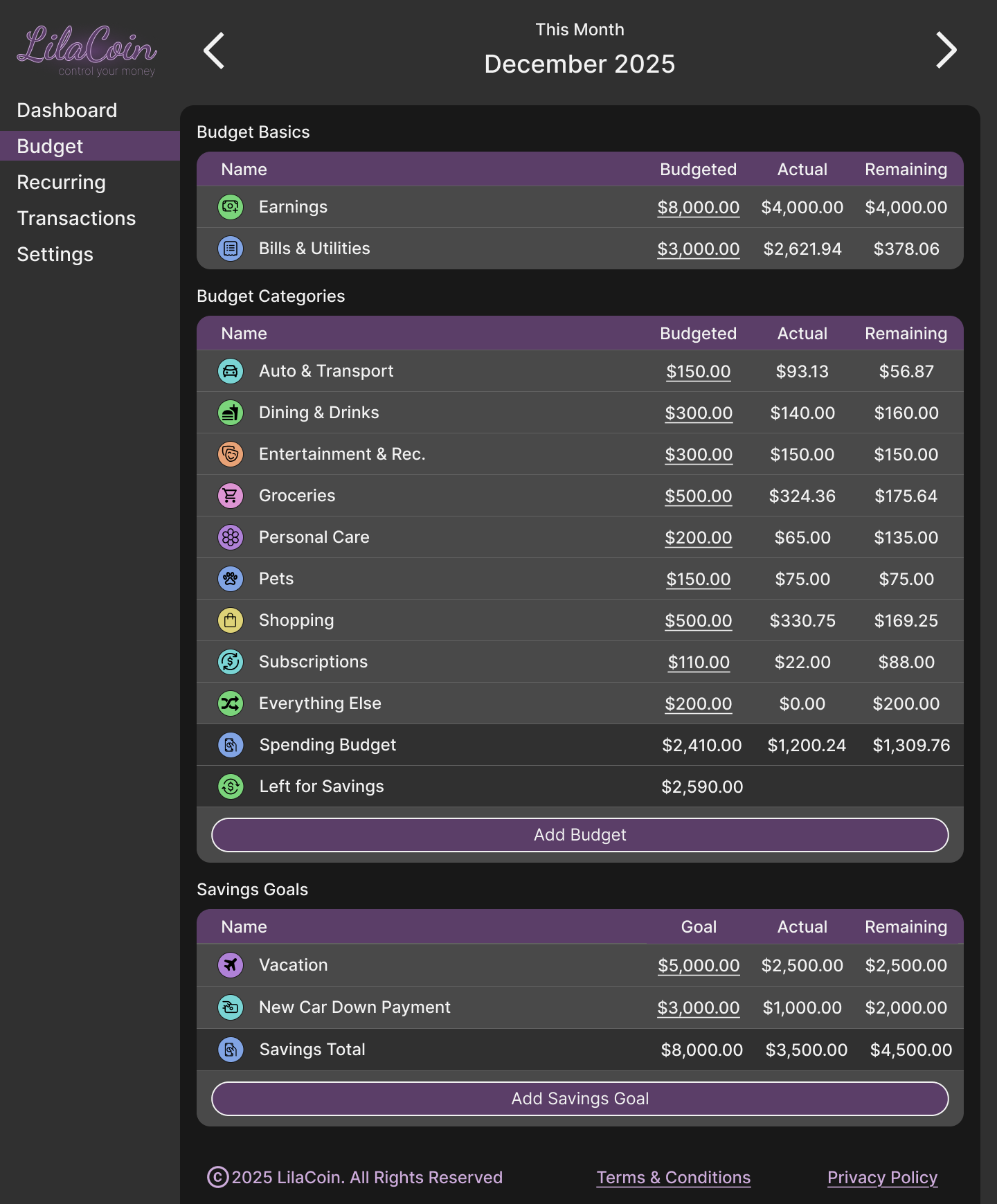
The Recurring pages provide extra details for each transaction, such as the account it’s drawn from. Users can still sort transactions by type, account, amount, or due date. The sort options are easy to access, with buttons arranged horizontally at the top, allowing users to sort with a single click.
When I started this project, my goal was to make it as realistic as possible while expanding my skills in Figma and improving design efficiency. This capstone project at TripleTen is something I’m proud of, though there are a few enhancements I would make to create a budgeting tool I would personally use.
For example, I’d add options to change the color theme, since not everyone prefers purple, and enable automatic switching between dark and light modes based on the user’s device settings. I would also explore allowing users to customize the dashboard layout to better suit their needs.
I spent more time on this project than the program allotted, but I wanted to ensure it was something I could be proud to showcase on my portfolio site. I really enjoyed creating this project, even though I faced some challenges along the way. The biggest challenge was deciding on the layout. I drew inspiration from Rocket Money, which I use for my own budgeting, but I also wanted to address a few things I didn’t like about it. This project allowed me to redesign it to my preferences, with the most significant change being easier access to the Budget page—the main feature I rely on.
Another challenge was managing time constraints, as I had to complete research, develop a persona, user journey, user flow, and product map, and create low-fidelity prototypes before starting the high-fidelity designs. On top of that, my perfectionist tendencies added extra time to the project, which was a challenge in itself.